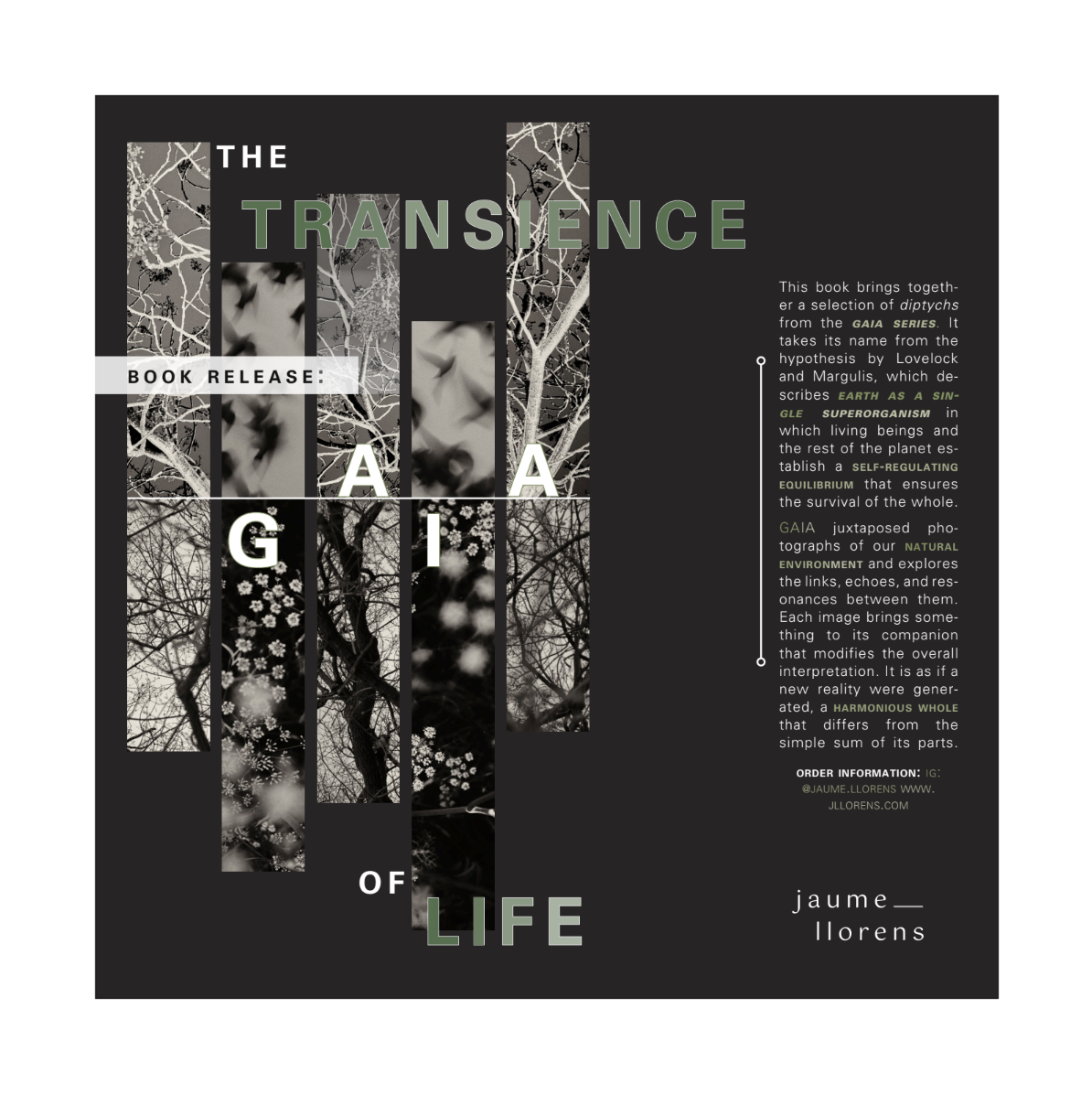
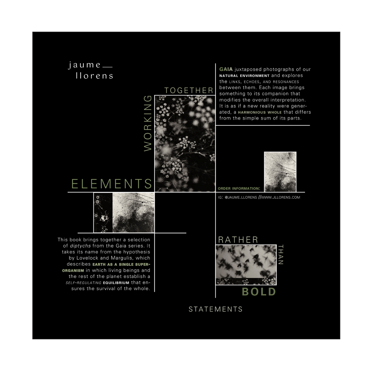
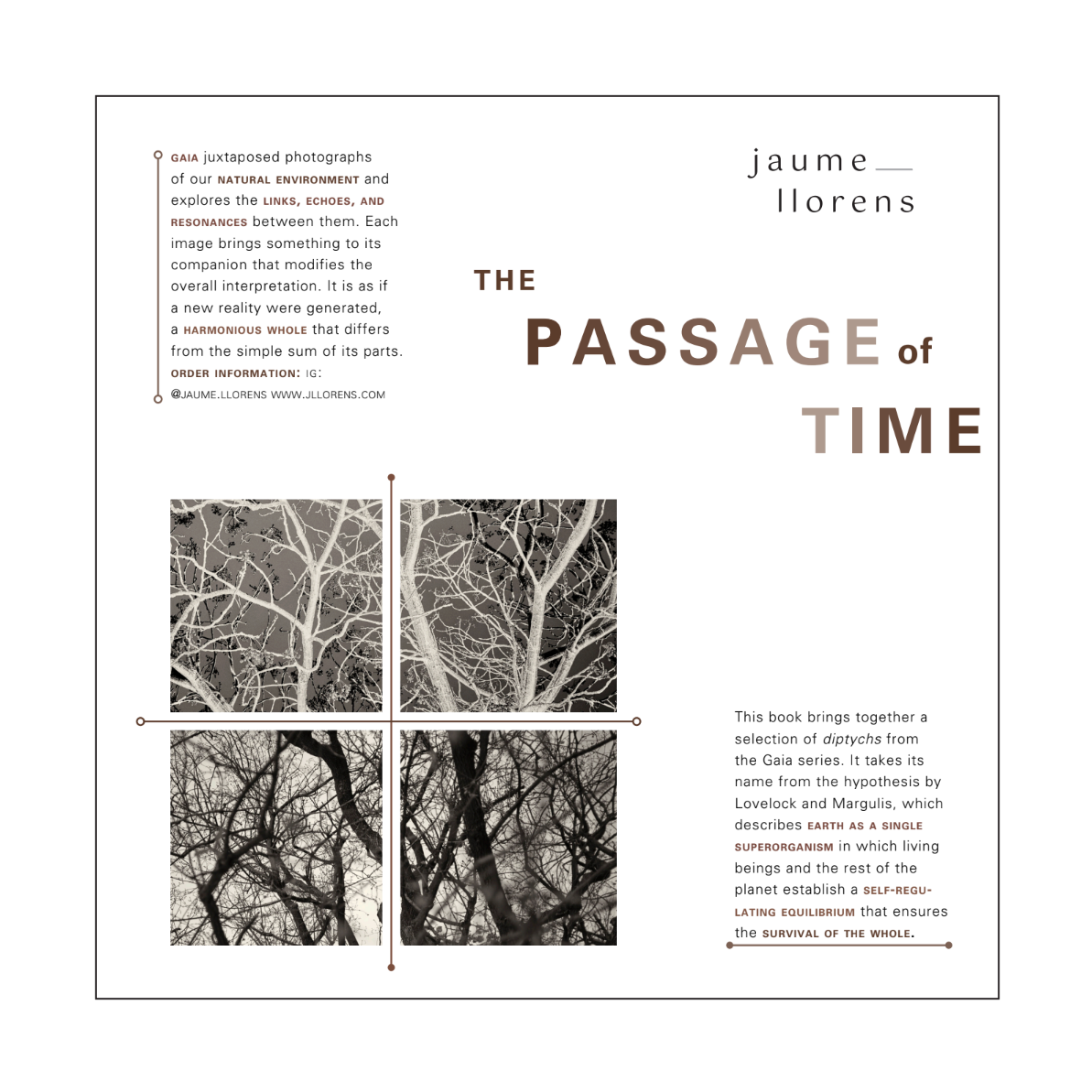
Project Brief
For this project, we explored the fundamentals of typography through a series of layouts that progressively increased in complexity. The project was divided into five sections, each introducing new typographic constraints and concepts. Section 1 focused on creating five layouts using only oblique and bold weights of 10-point Univers. Section 2 introduced scale, with a minimum type size of 8 points. In Section 3, we explored the axis, followed by Section 4, which incorporated graphic elements such as line, point, and plane, as well as bleeding. Finally, Section 5 combined graphic elements with image.
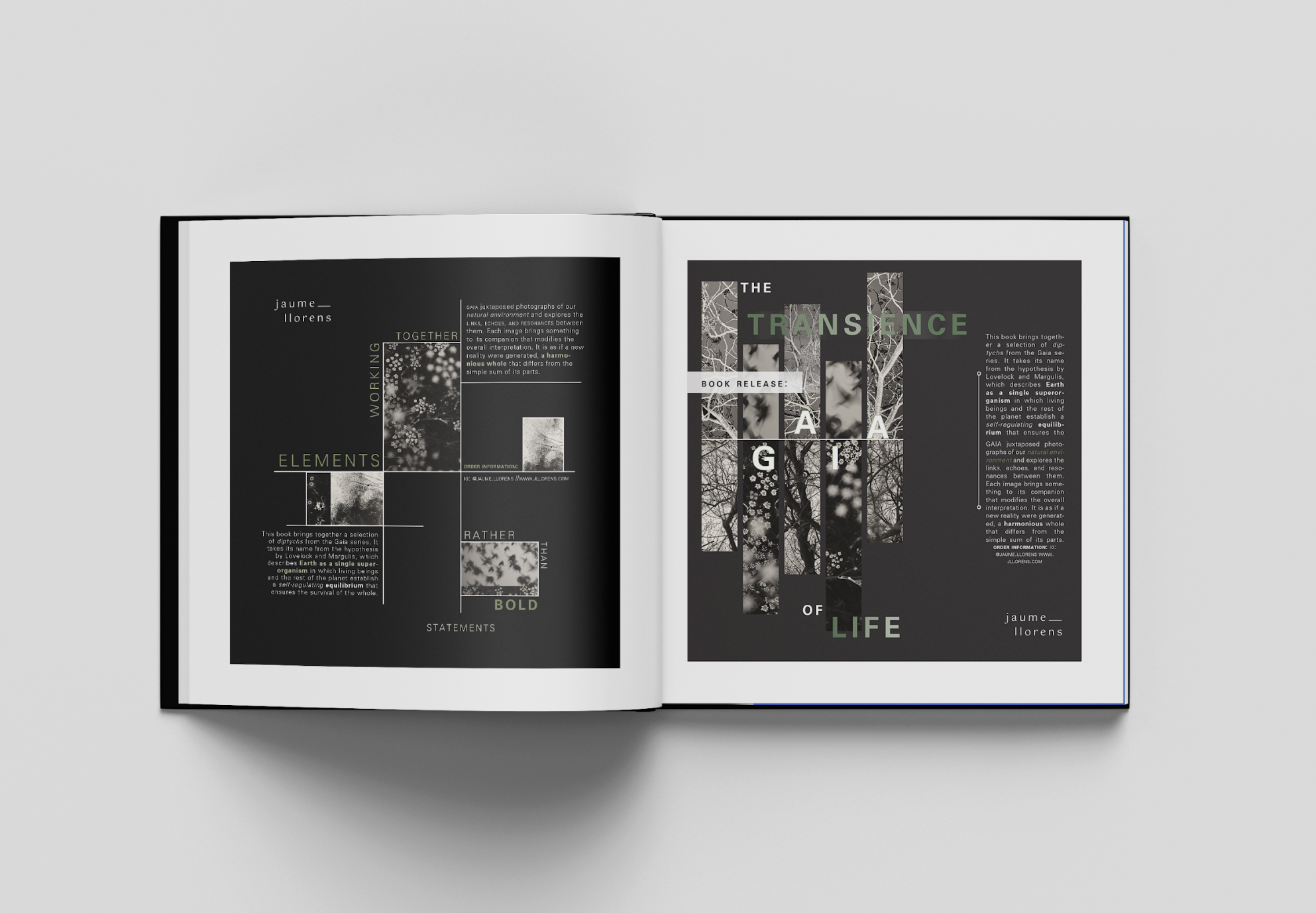
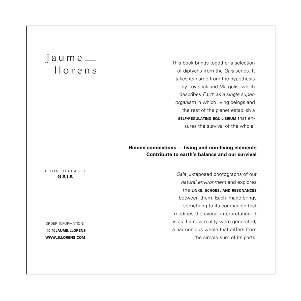
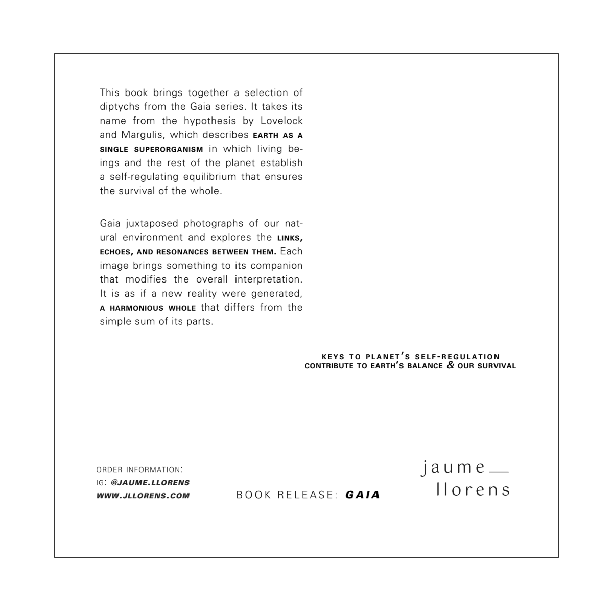
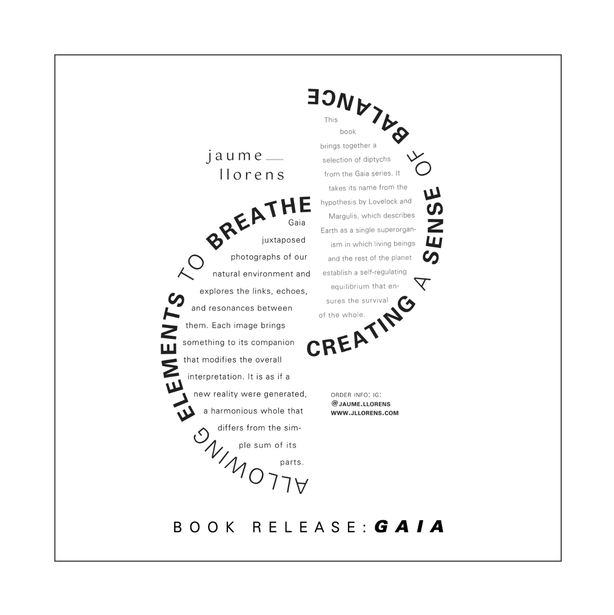
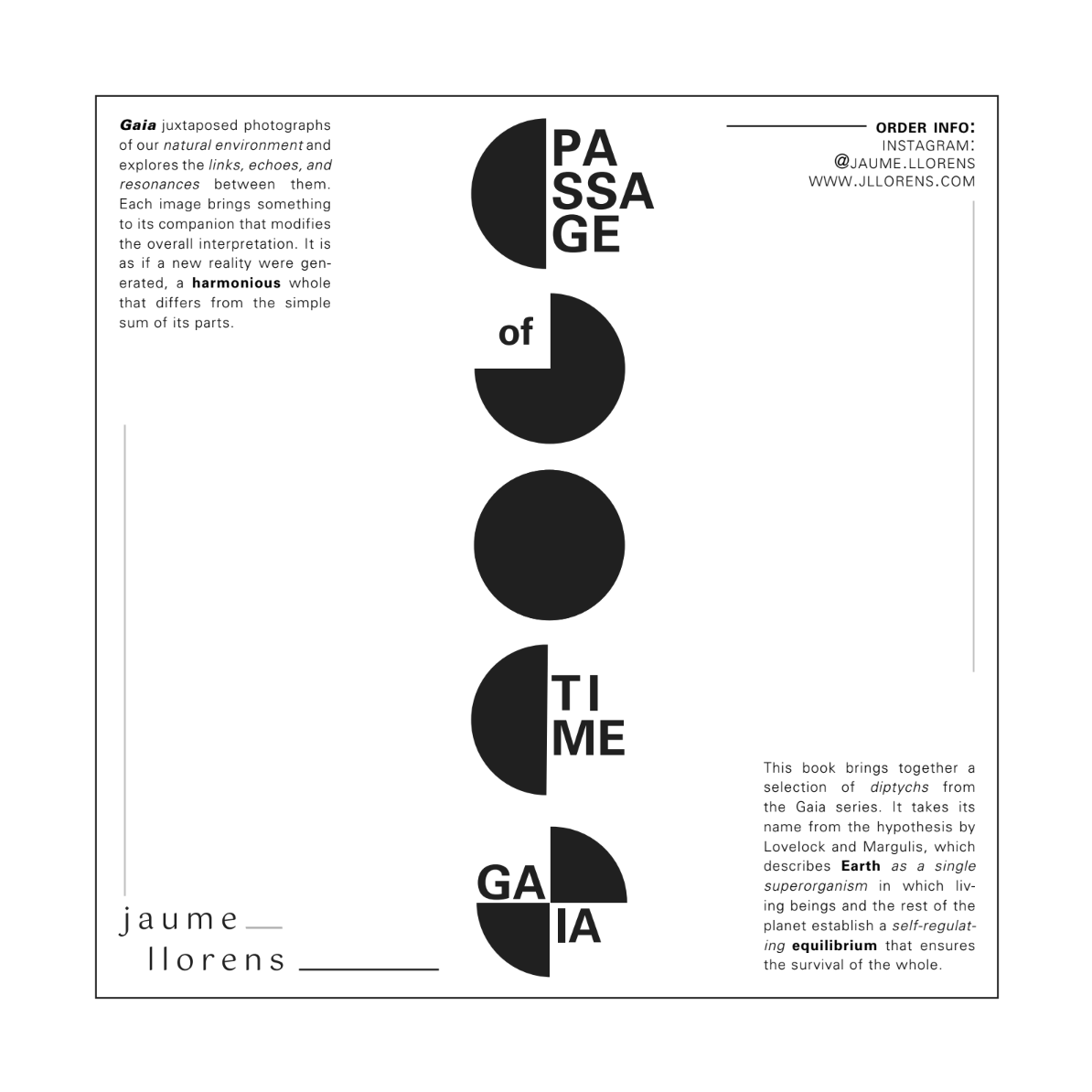
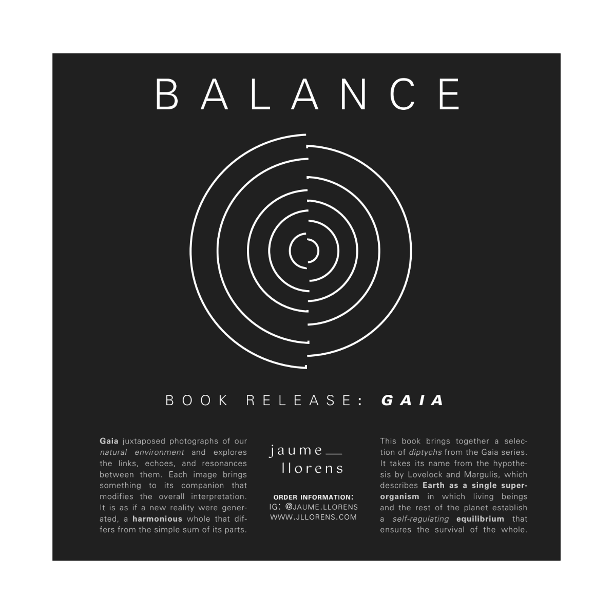
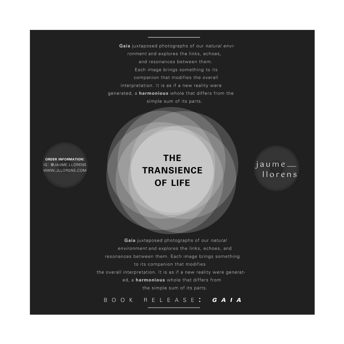
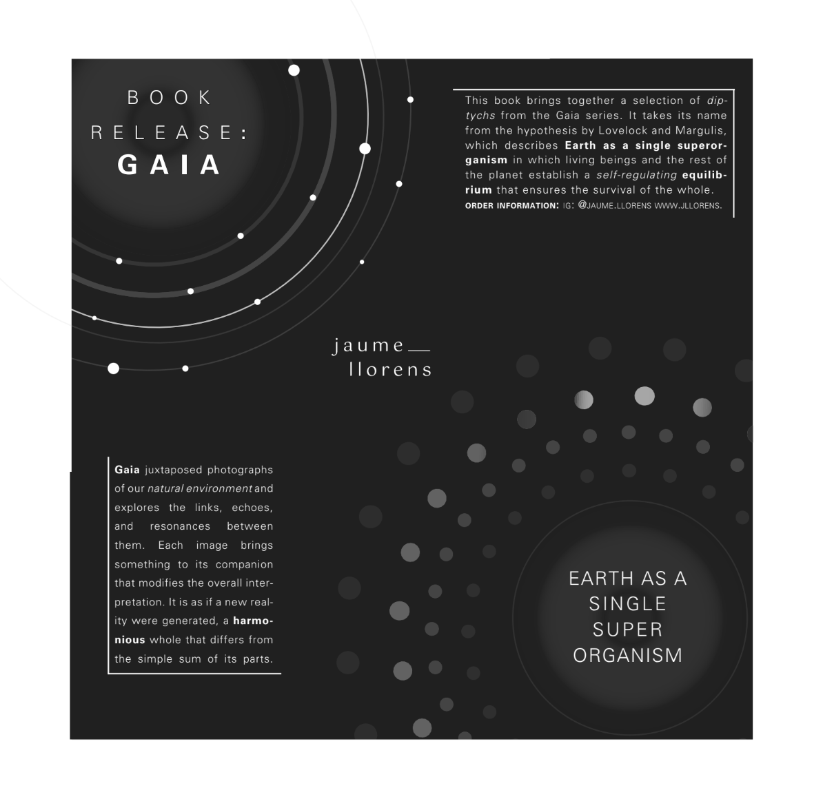
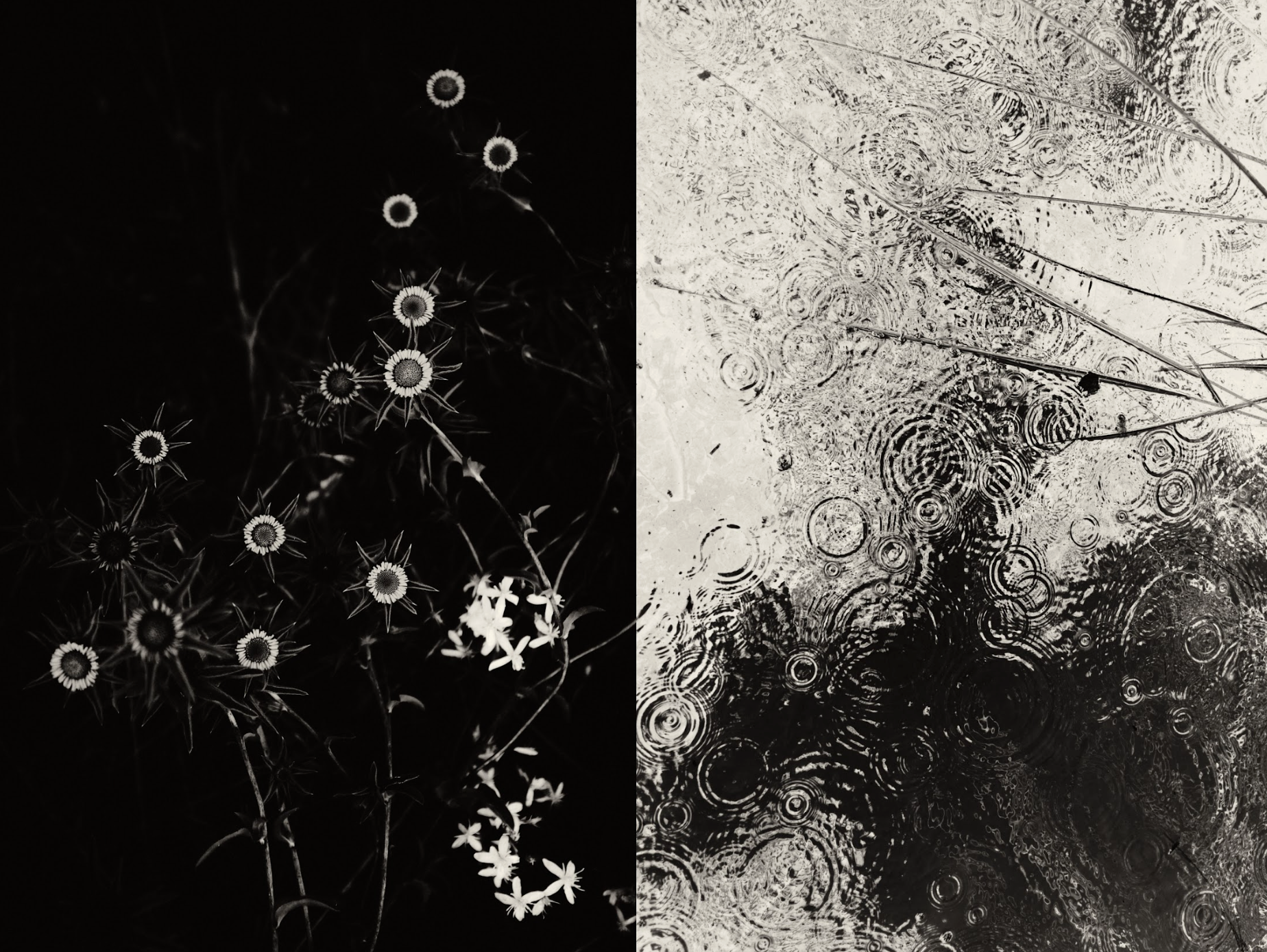
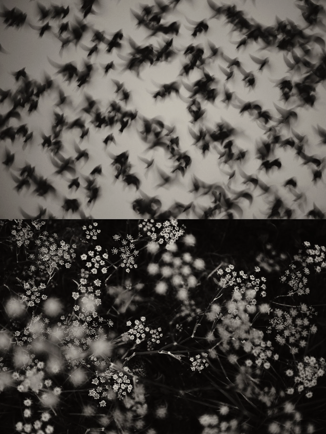
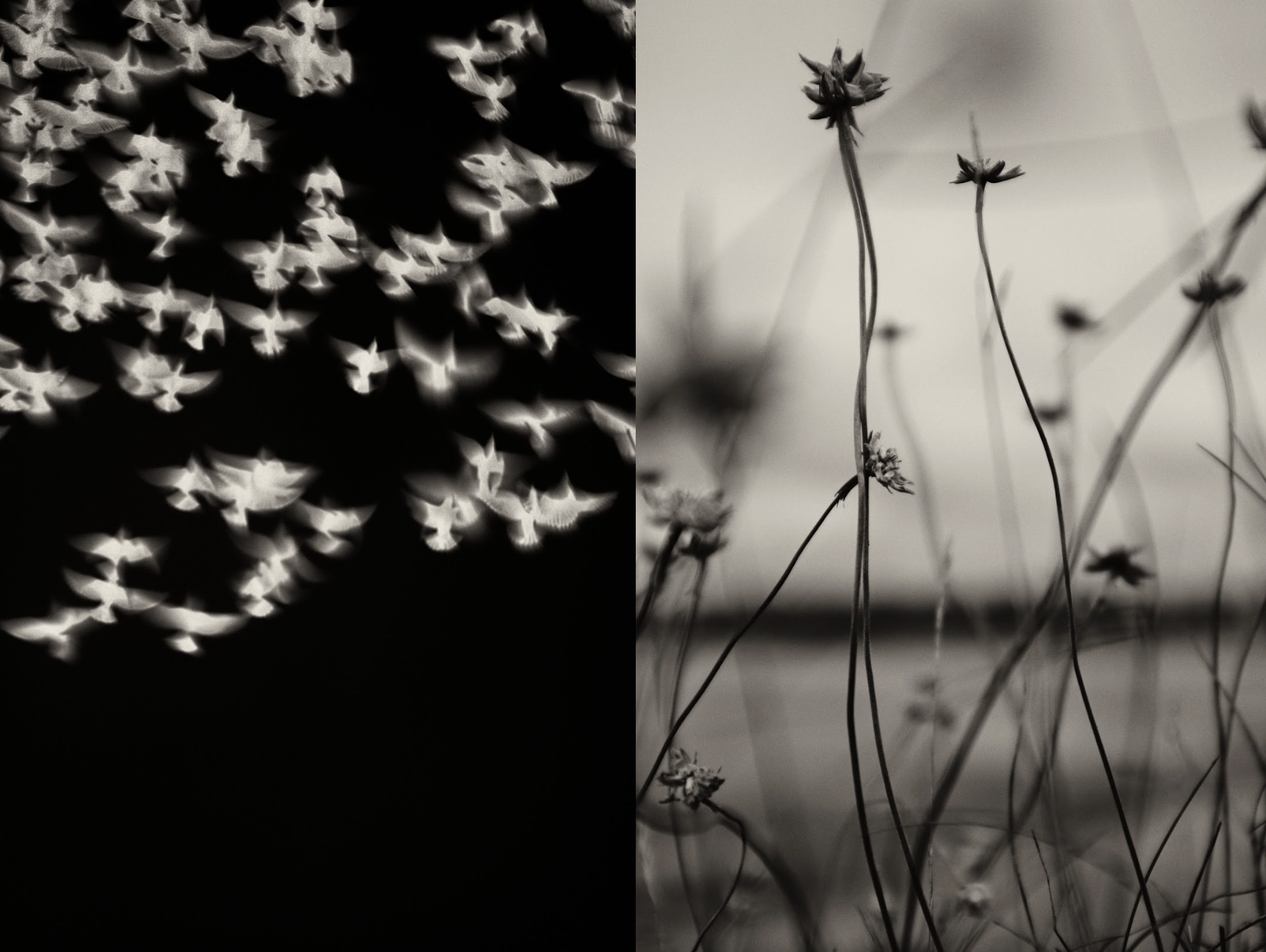
I was assigned the work of photographer Jaume Llorens and designed layouts to promote his book GAIA. Llorens’ black-and-white photography became a major influence on my design approach, such as the overall tone, contrast, and compositions. The simplicity, texture, and dramatic use of light in his imagery guided my typographic decisions, encouraging a balance between clarity and expression while allowing the type to complement the imagery rather than compete with it.
In total, the project resulted in 25 unique layouts that demonstrate a growing command of designing with type. Each page reflects an understanding of typographic fundamentals (including tracking, bold, oblique, italics, x-height, baseline, and leading) used intentionally to create hierarchy and guide the viewer’s eye through the page and demonstrate my command on hierarchy.
Sketches + Research/Inspo

Section 1:
Oblique and bold weights of 10-point Univers

Final Designs


Sketches + Research/Inspo

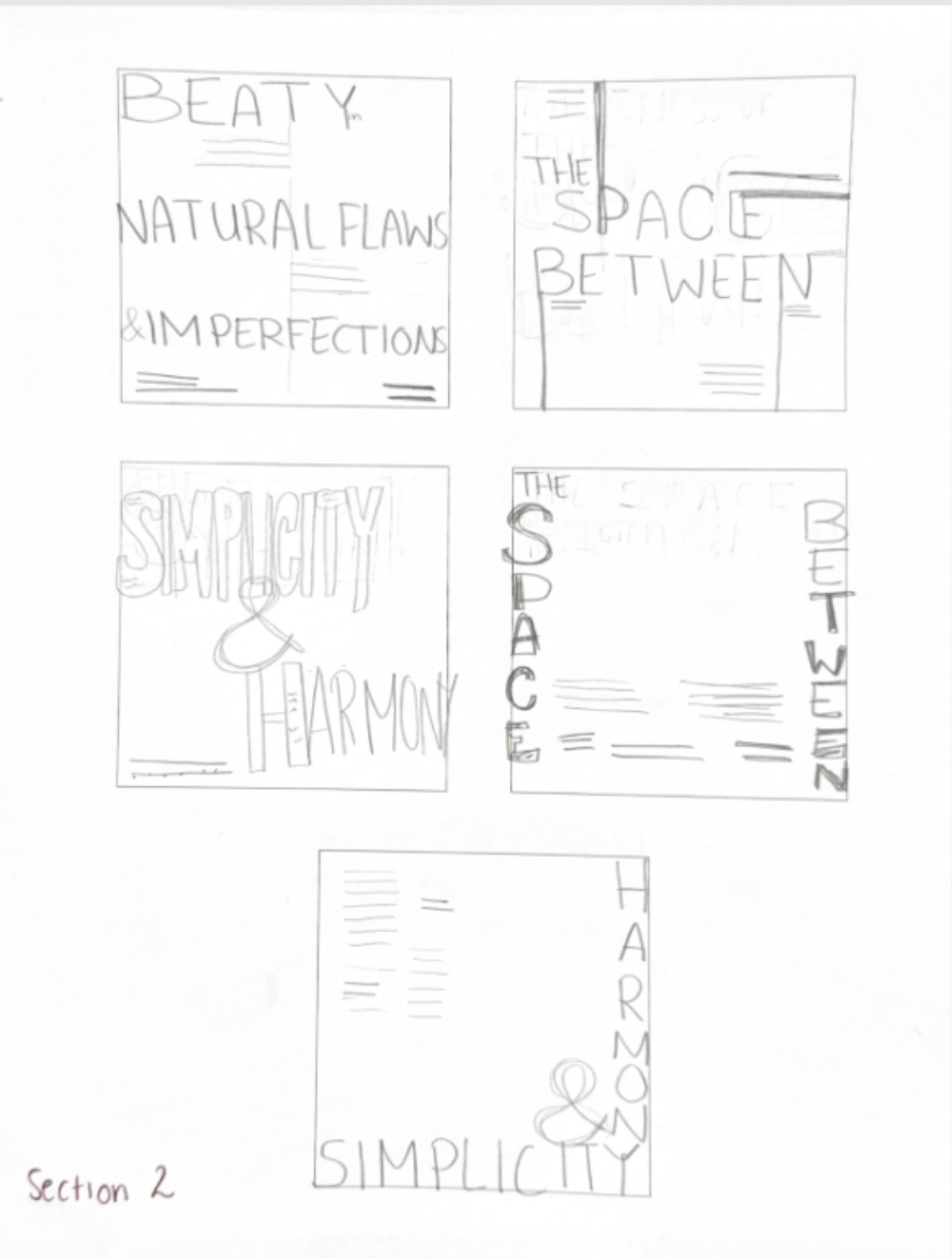
Section 2:
Scale + a minimum type size of 8 points


Final Designs


Sketches + Research/Inspo

Section 3:
Axis


Final Designs


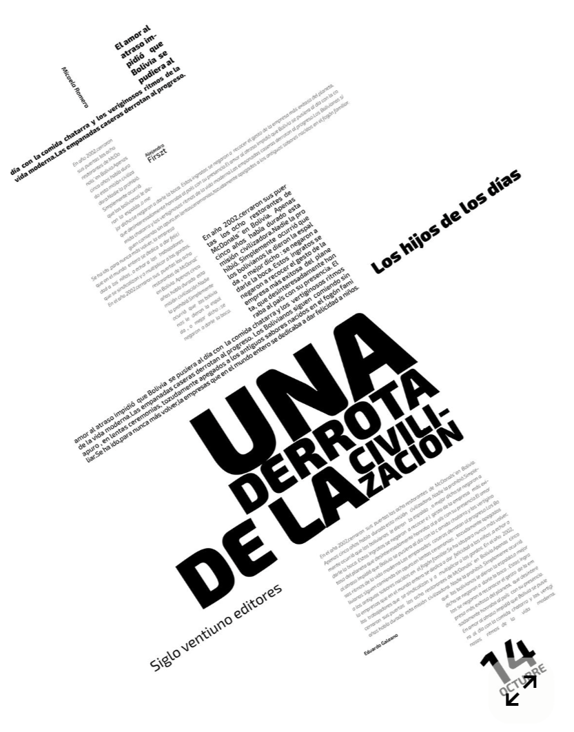
Sketches + Research/Inspo

Section 4:
Graphic elements: line, point, and plane, & bleeding


Final Designs

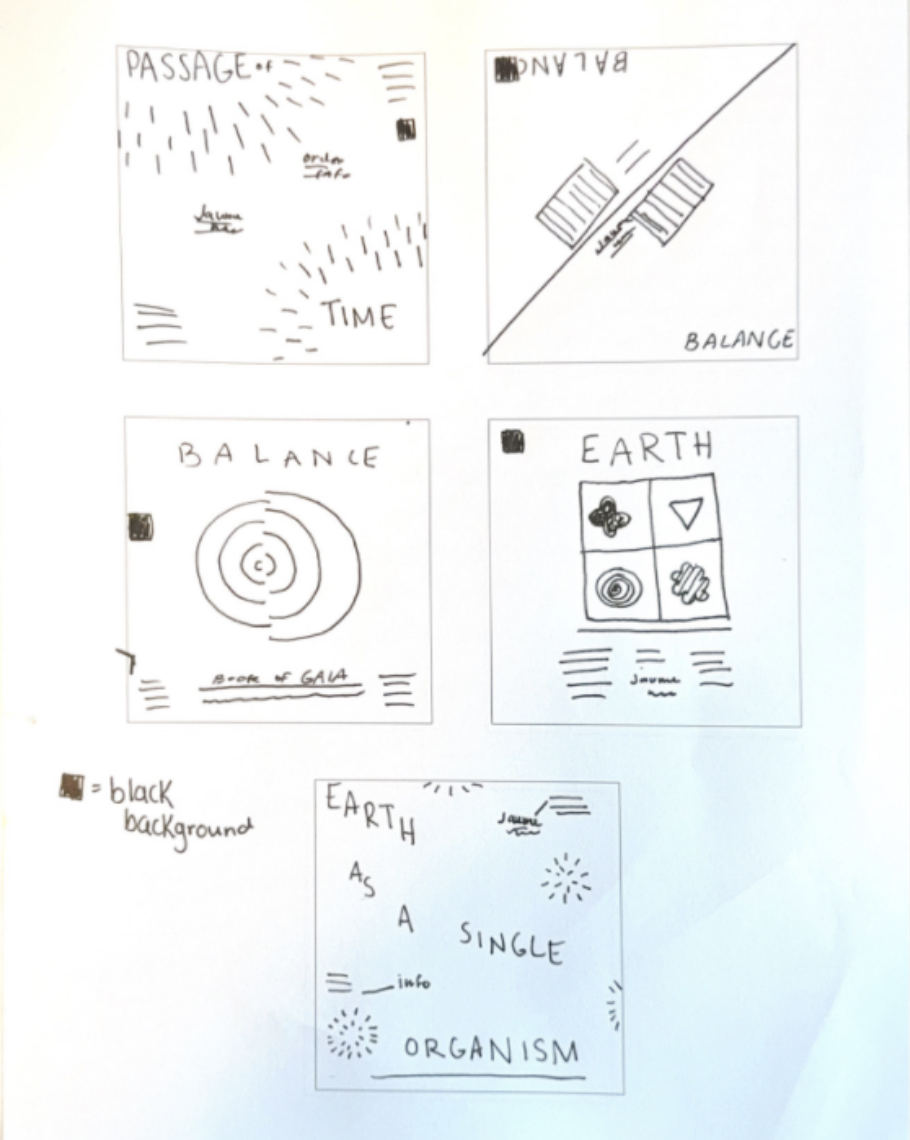
Sketches + Research/Inspo
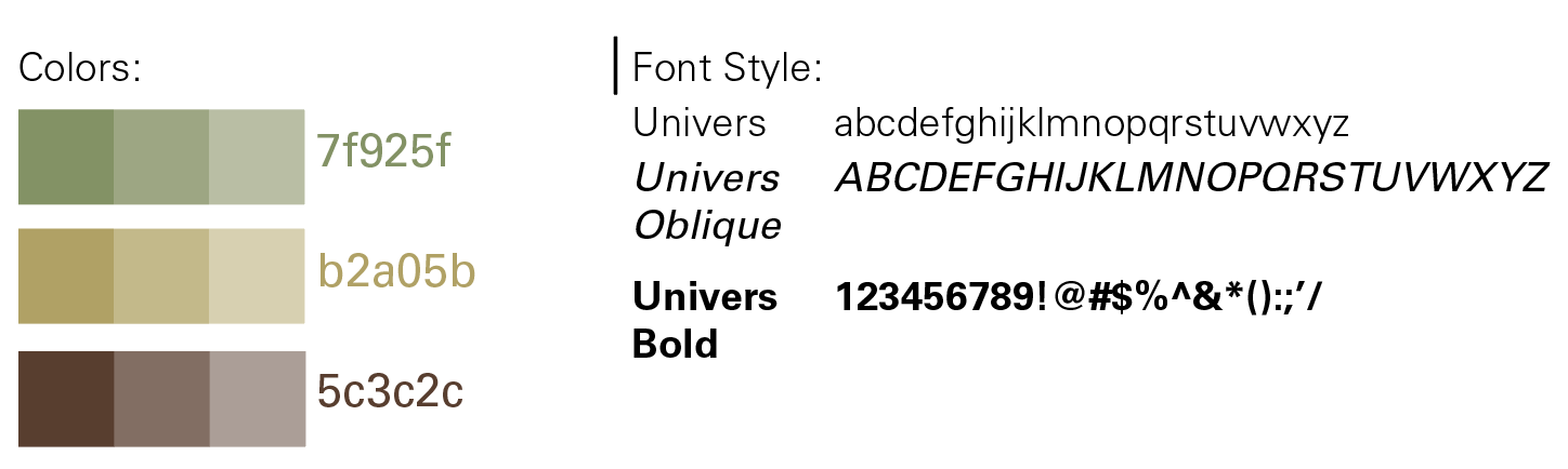
Font + Colors + Images Used
Section 5:
Graphic elements: line, point, and plane, & bleeding
Final Designs


Final Mockups