
Design Brief
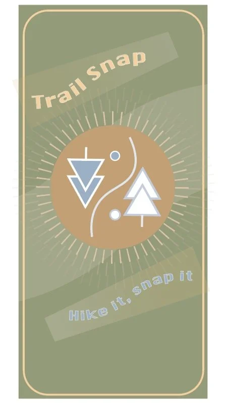
The goal of this project was to simulate a real-world design commission and begin practicing what it’s like to work in a professional setting. We were tasked with creating a logo that reflected a brand identity centered around a topic that personally interested us. For my project, I designed branding for a hiking app called Trail Snap, which helps users find the best photo-worthy hiking spots. Throughout the process, we explored different levels of abstraction and learned how to distill a complex concept—like trees, trails, cameras, and photography—into a single logo that could effectively communicate the brand’s essence. I chose to represent the hiking aspect with simple, stylized trees and a path running through the center. To connect it with photography, I enclosed the design within a circular shape, evoking a camera lens. For the color palette, I focused on earthy tones—greens, browns, yellows, and blues—experimenting with tints and hues until I arrived at a combination that felt natural and cohesive. Starting from a rough sketch, I developed the design into a clean, versatile logo that could scale down to app size while remaining recognizable. We then had the opportunity to apply our logo in real-world mockups, including creating a custom-designed bag. This part of the project allowed us to explore logo variations, patterns, and how branding carries across physical products, pushing us to think about design beyond the digital space.


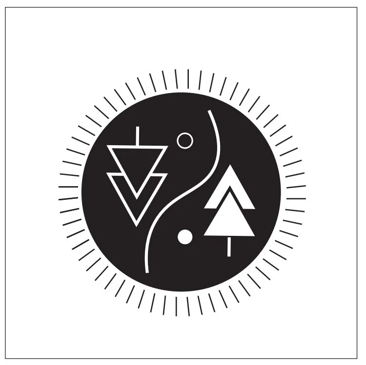
Final Logo & Border Exploration


Trail Snap
〰️
Trail Snap 〰️

Color Research & Exploration

Font


Background Variations


Trail Snap
〰️ Hike It, Snap It 〰️
Trail Snap 〰️ Hike It, Snap It 〰️

Phone app mockup
Coffee Cup Mockup for social events
Final Application & Mock ups


Stationery


Stickers
Bag Mockup

