Poster Series
Project Brief
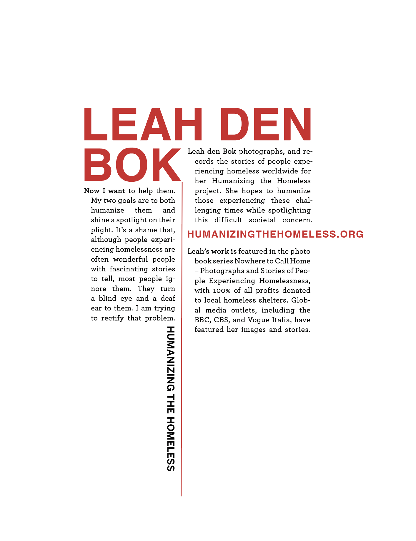
This project involved designing a series of three posters addressing the theme Humanizing the Homeless, a non-profit organization founded by photographer Leah den Bok. The objective was to create a cohesive poster triptych in which each poster functions independently while also contributing to a unified visual narrative when presented as a series.
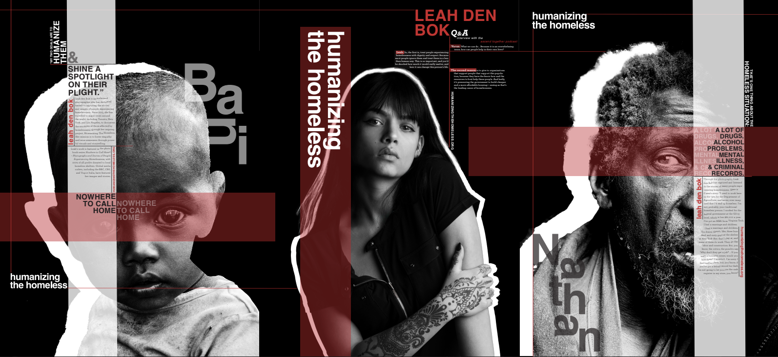
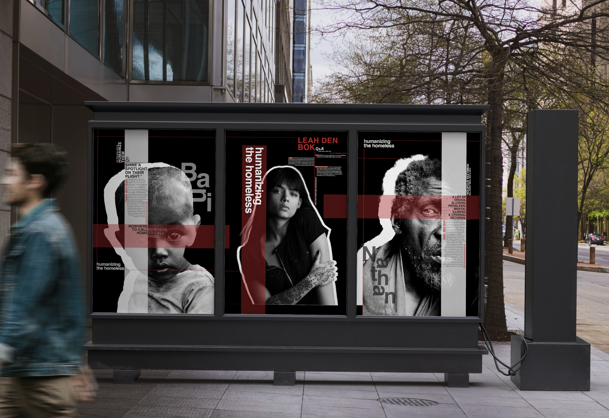
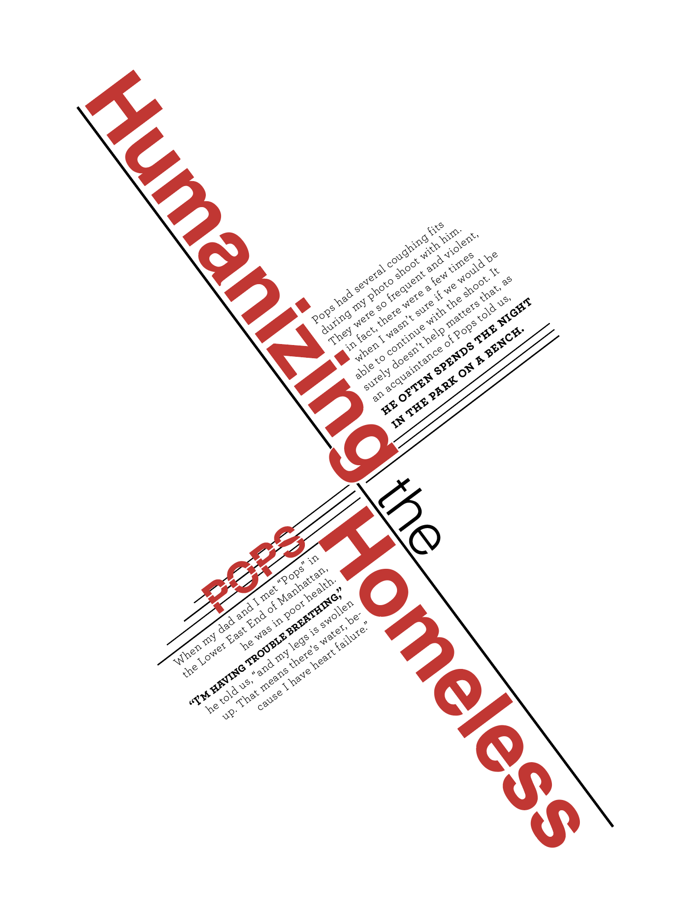
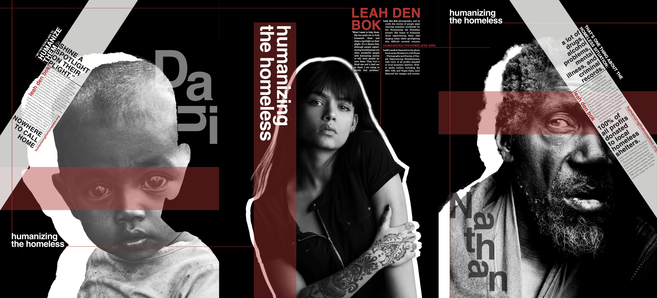
Throughout the design process, I explored visual hierarchy, scale, and experimental typography to create layouts that would attract attention from a distance and invite viewers to engage more closely with the content. A major focus of the project was the expressive use of each person’s name as a typographic element, allowing type to communicate emotion and meaning beyond simple readability. Grid systems were used to unify the series while still allowing variation in hierarchy and composition across each poster.
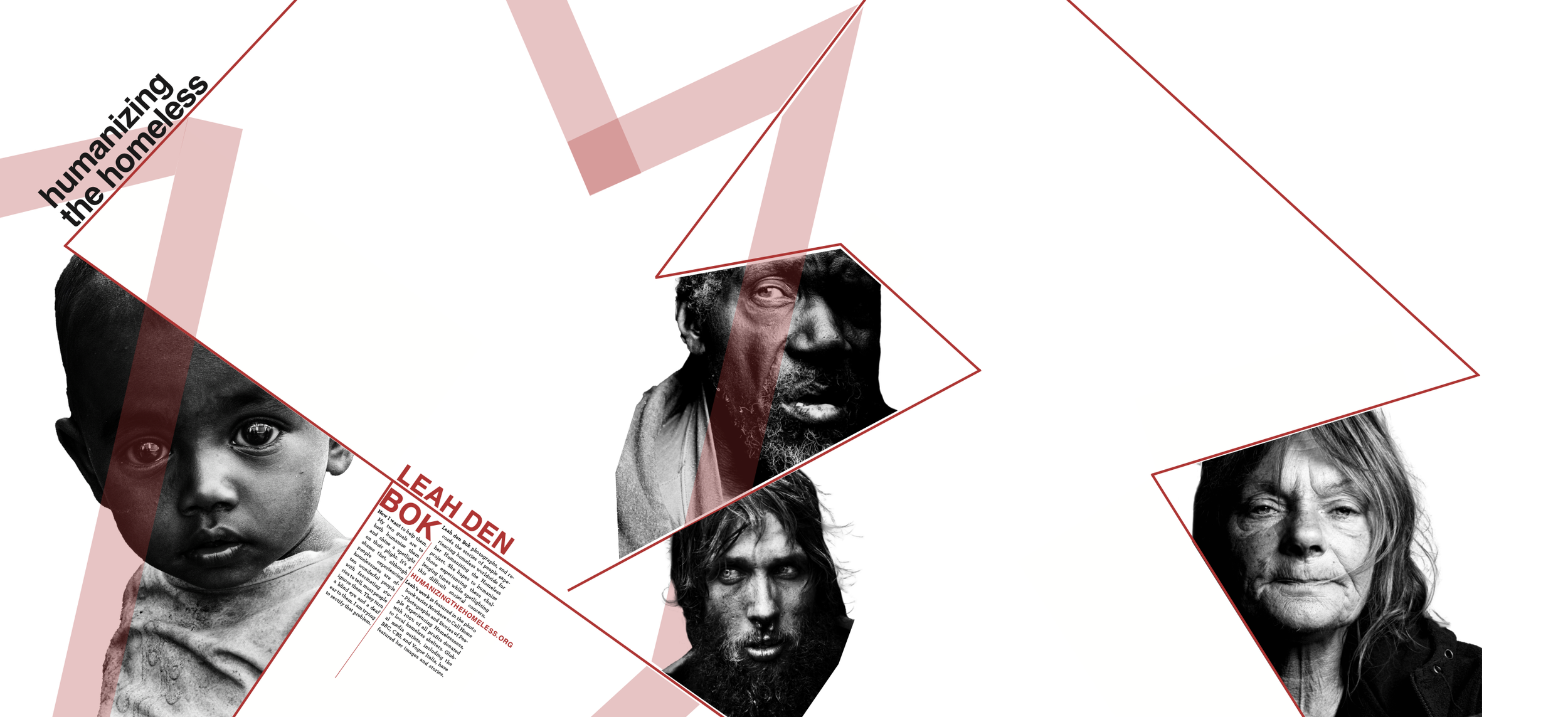
I developed two primary design directions. In the first, I explored the idea that people experiencing homelessness are often overlooked or not fully seen as individuals. This concept was communicated by using outlined figures that were intentionally left partially unfilled, symbolizing invisibility and the lack of recognition faced by the homeless population. This approach reinforced the project’s core message of “humanizing” by visually emphasizing absence and erasure.
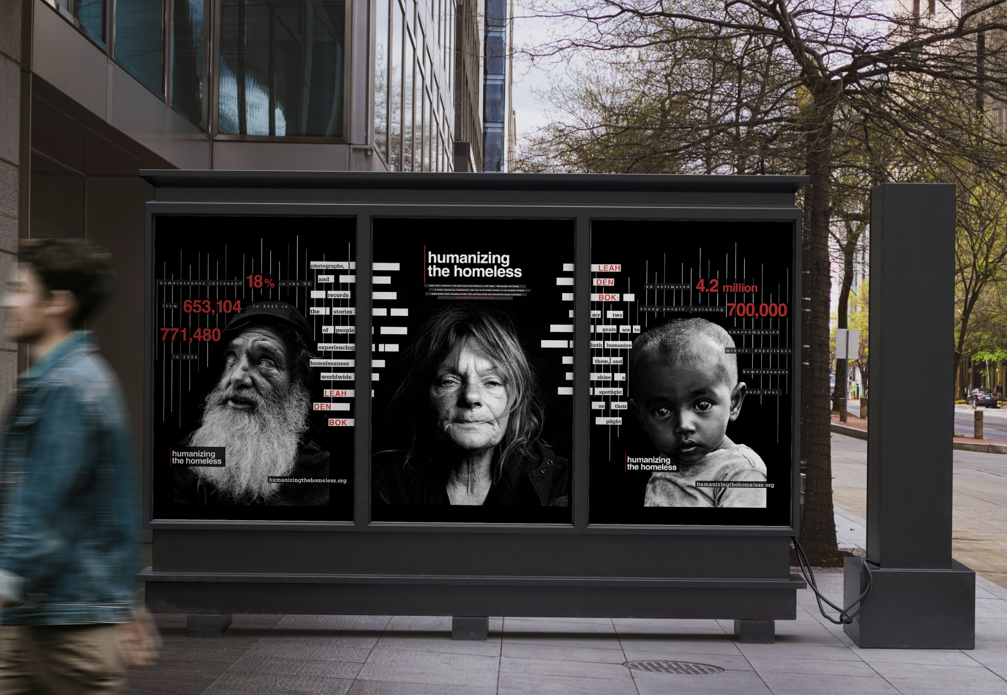
The second design direction focused on reclaiming visibility by highlighting each individual through strong linear elements. These lines referenced statistical tables, which led me to incorporate U.S. homelessness statistics into the compositions. By combining personal imagery with data-driven visuals, this approach contrasted human stories with the impersonal nature of statistics, emphasizing how easily people are reduced to numbers rather than recognized as individuals.
Text/layout Explorations:


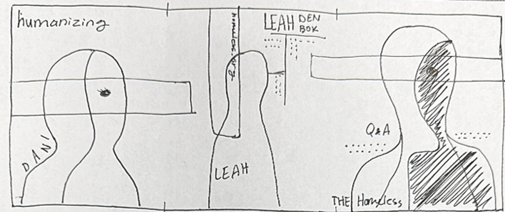
Sketches + Drafts:


Fonts + Colors

Final Designs + Mockups