Multipage Book
Design Brief
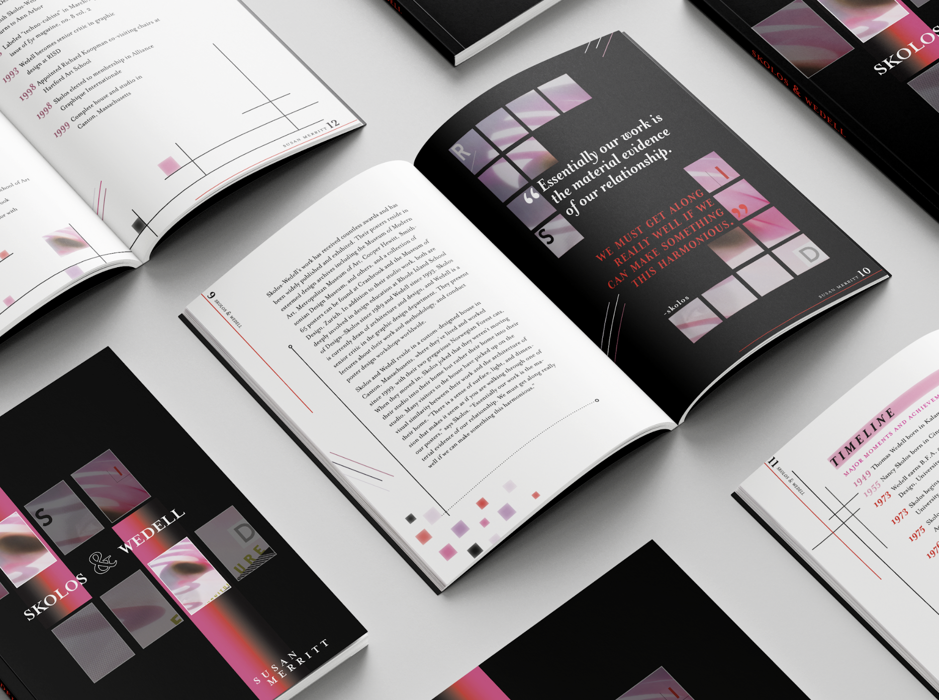
This project explores typographic structure and hierarchy through the design of a multi-page, 5 × 8 inch book developed using the Golden Section. The content is an article by Professor Susan Merritt examining the work of design duo Nancy Skolos and Tom Wedell. The objective of the project was to strengthen type sensitivity by focusing on type mechanics, layout systems, and consistency across multiple pages.
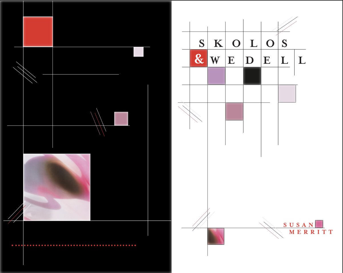
The book includes a cover, title page, table of contents, running headers, folios, pull quotes, images, and a timeline, all unified through a single typeface family and a one- to two-column grid system. Throughout the process, I explored variations in paragraph structure, spacing, hierarchy, and navigational elements to establish visual flow and readability.
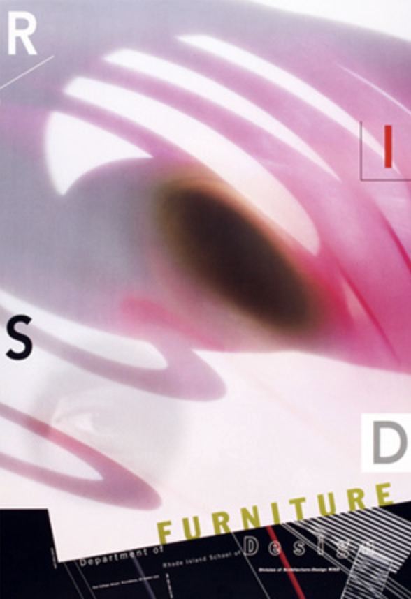
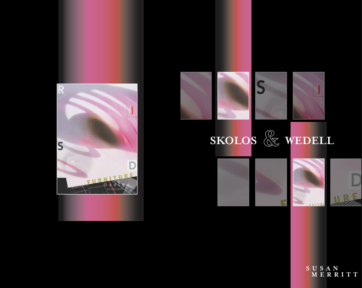
My design approach was inspired by Skolos and Wedell’s experimental imagery and their website, which features bold geometry, modular structures, and playful visual rhythms. These elements influenced my layout decisions and helped guide the overall tone of the book.
Research/Inspo: Skolos and Wedell’s website + images
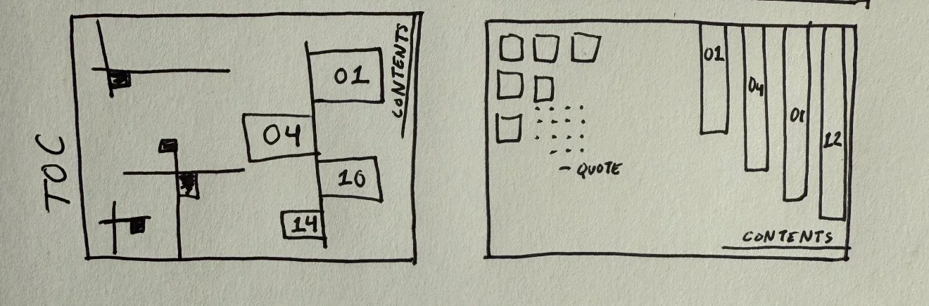
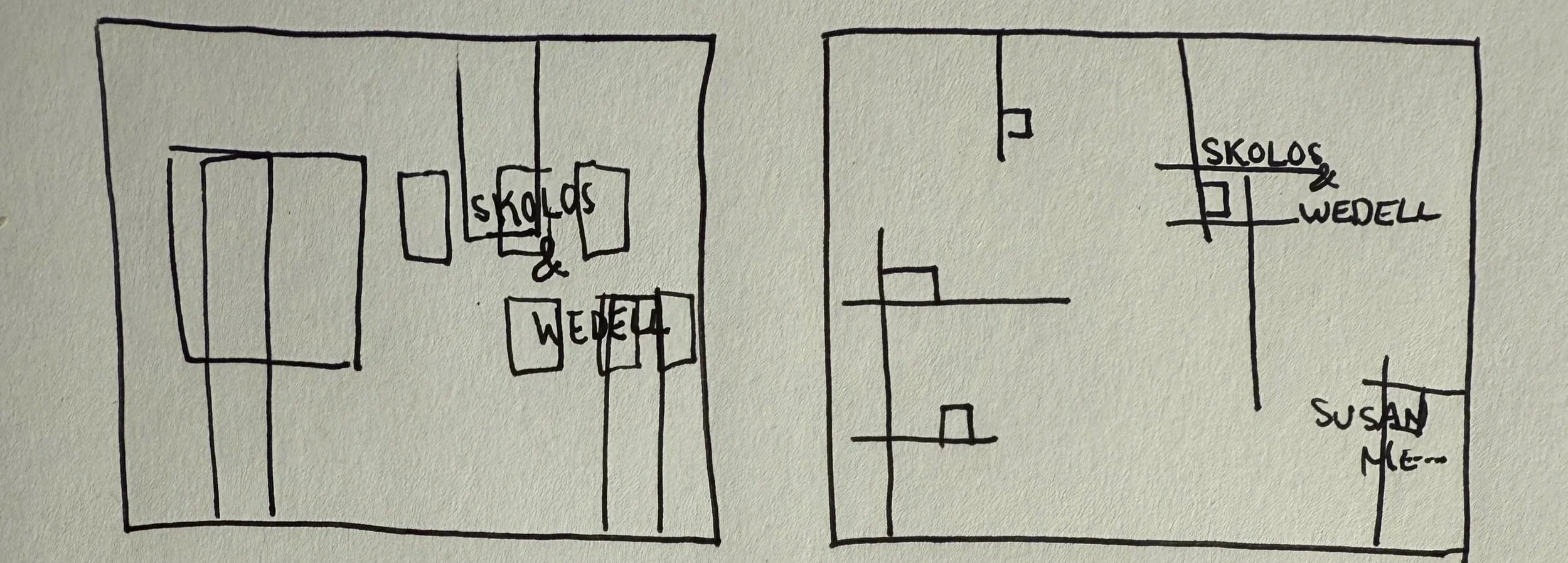
Sketches:
Drafts/Iterations:

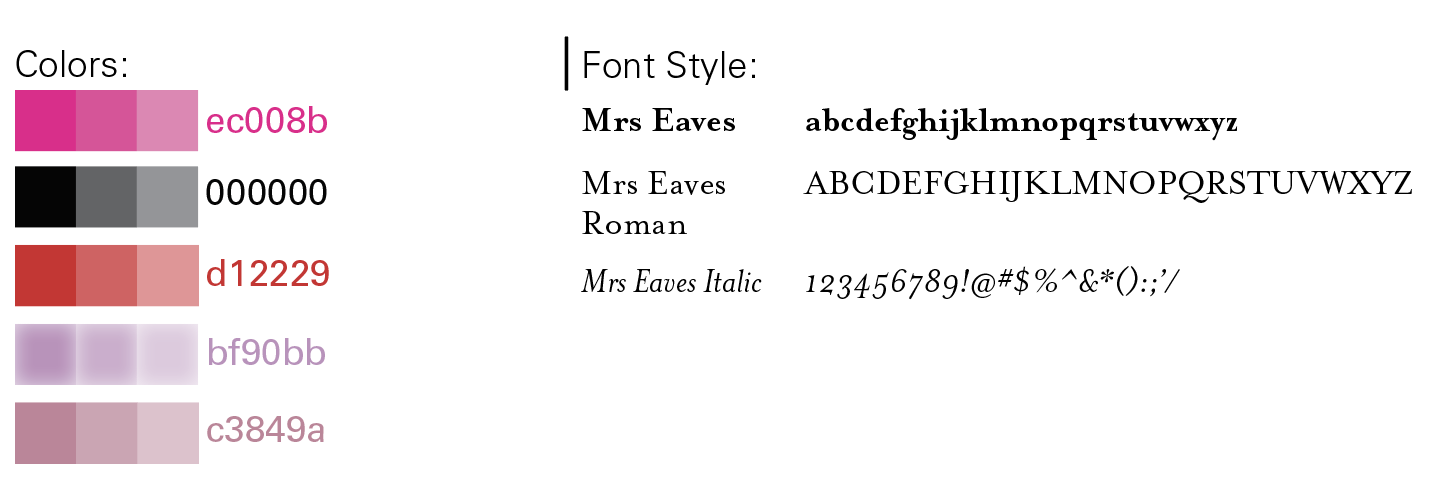
Fonts + Colors + Image Used:

Final Design
-
![]()
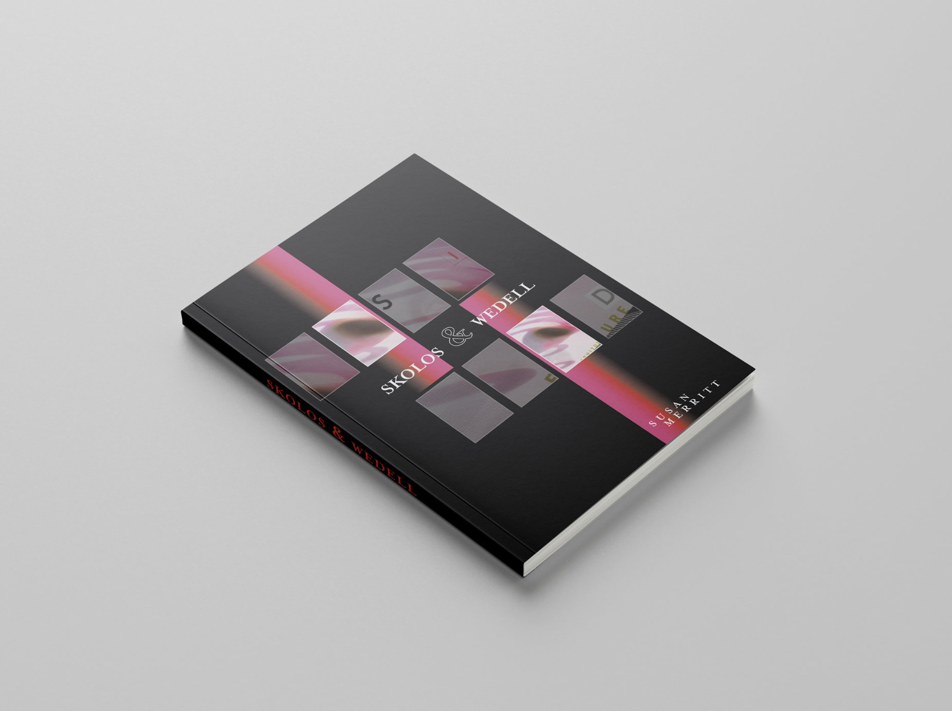
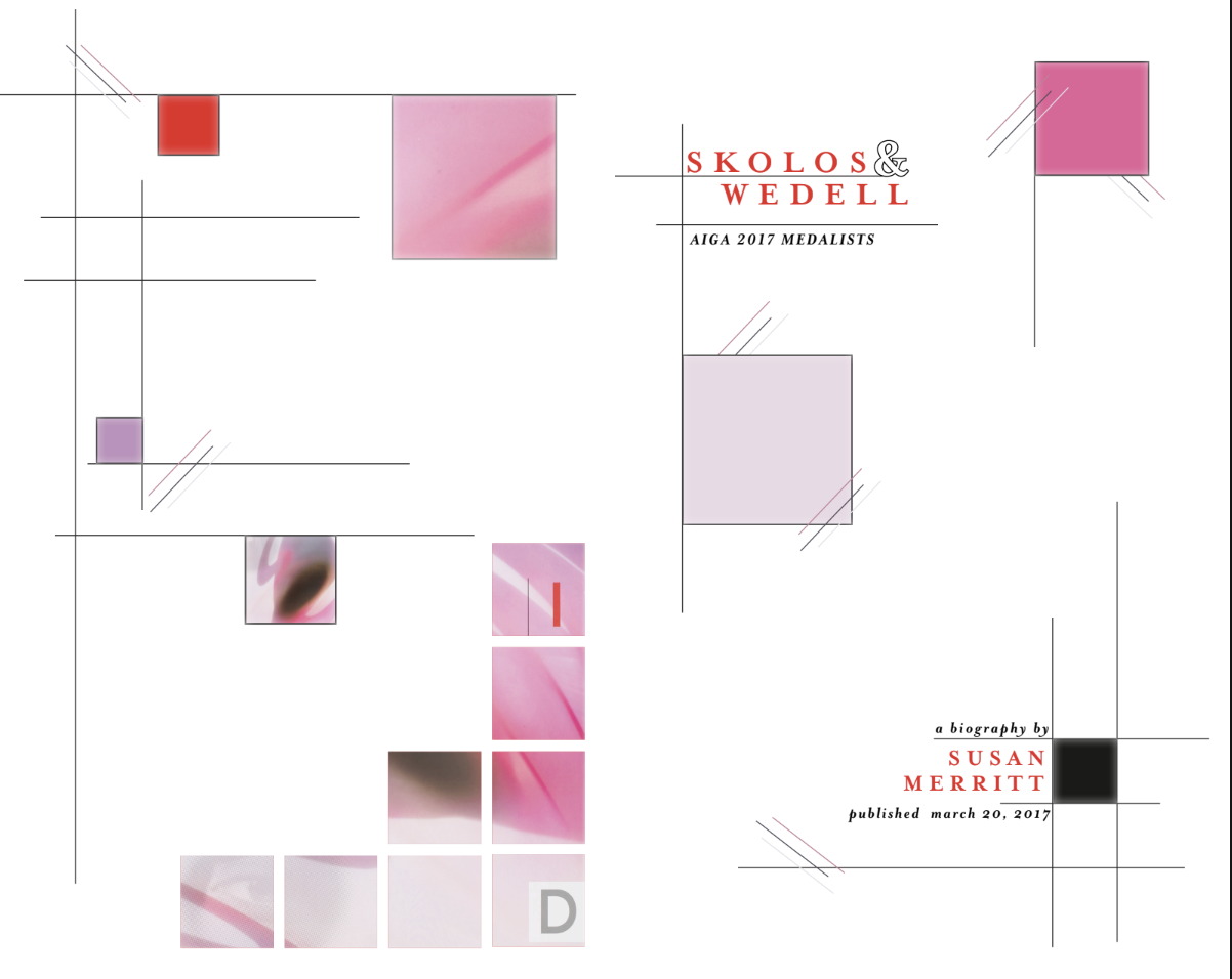
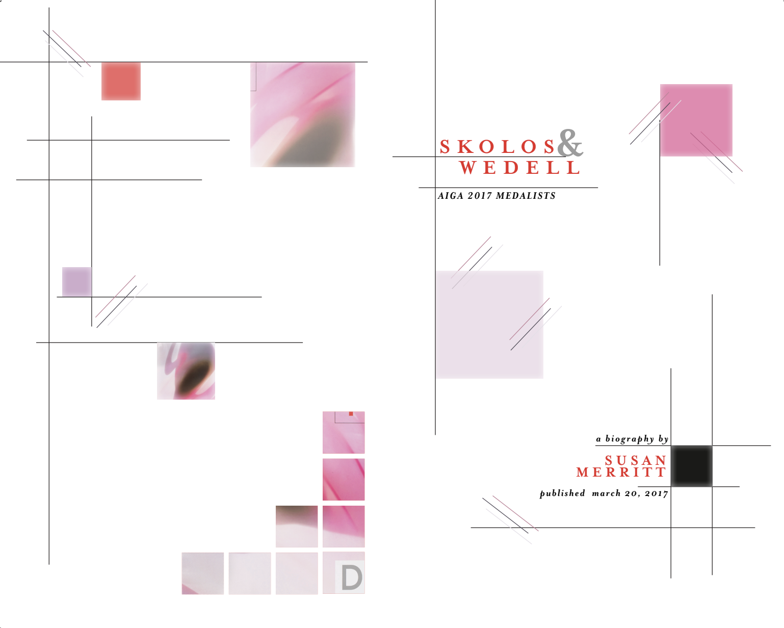
Cover
-
![]()
Title Page
-
![]()
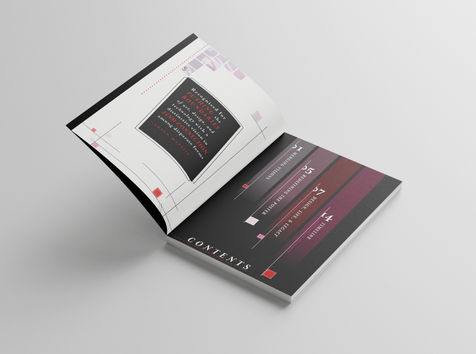
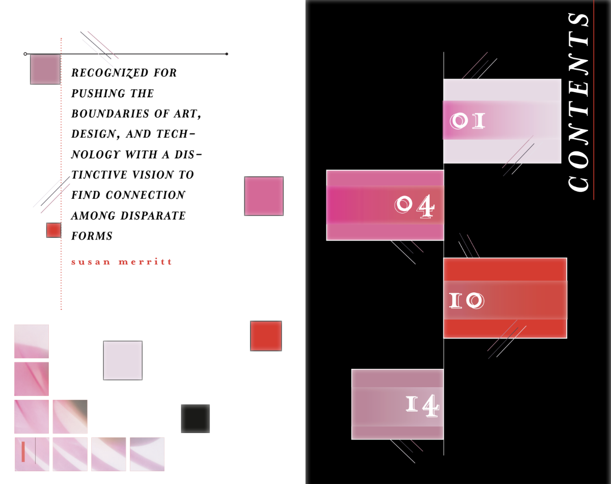
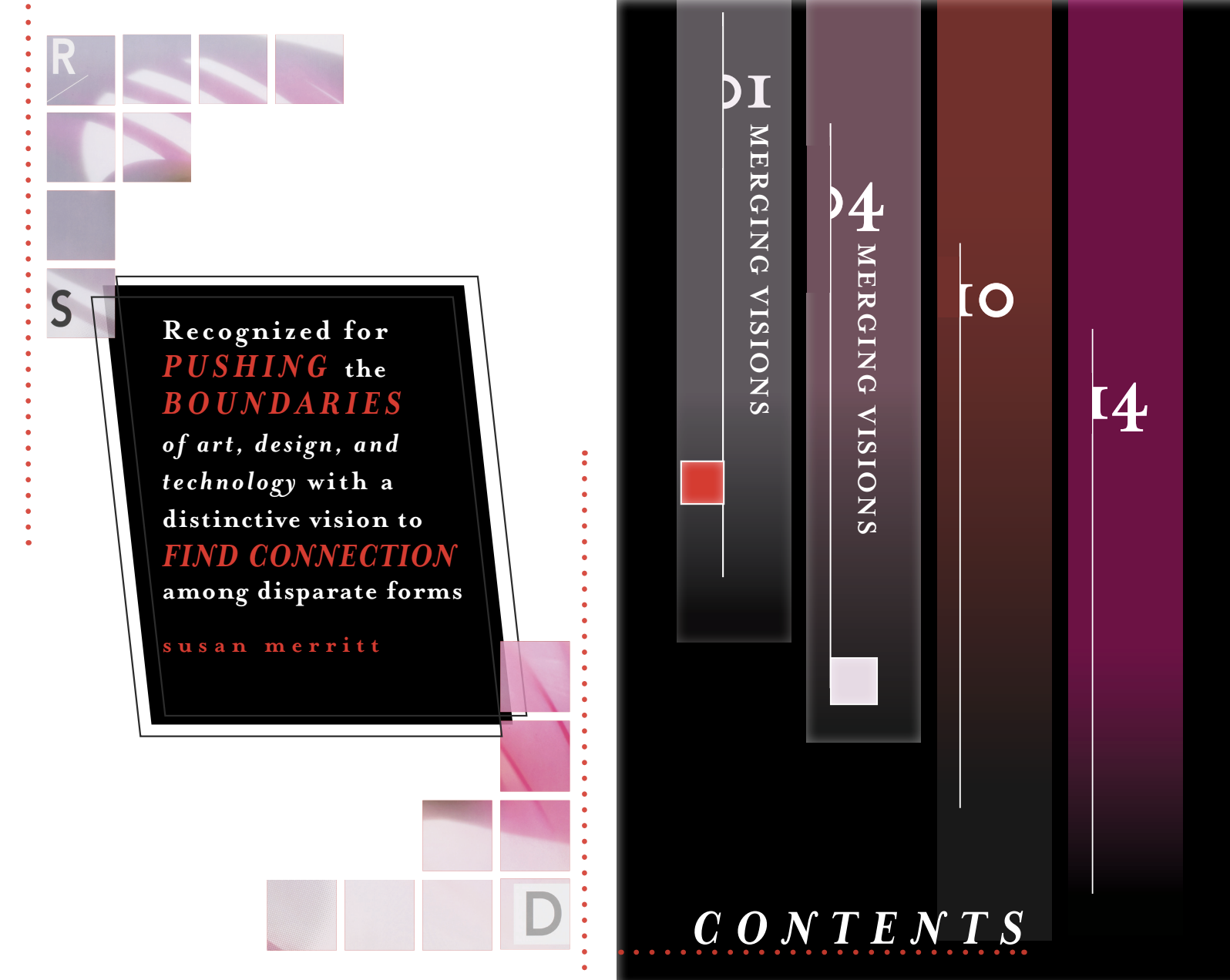
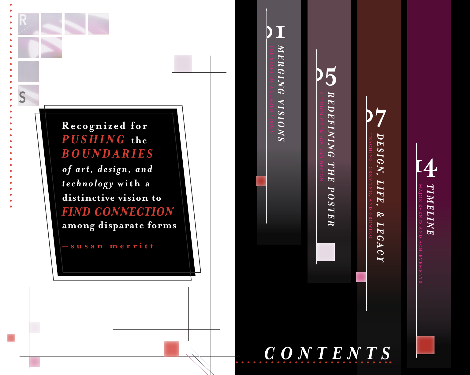
Table of Contents
-
![]()
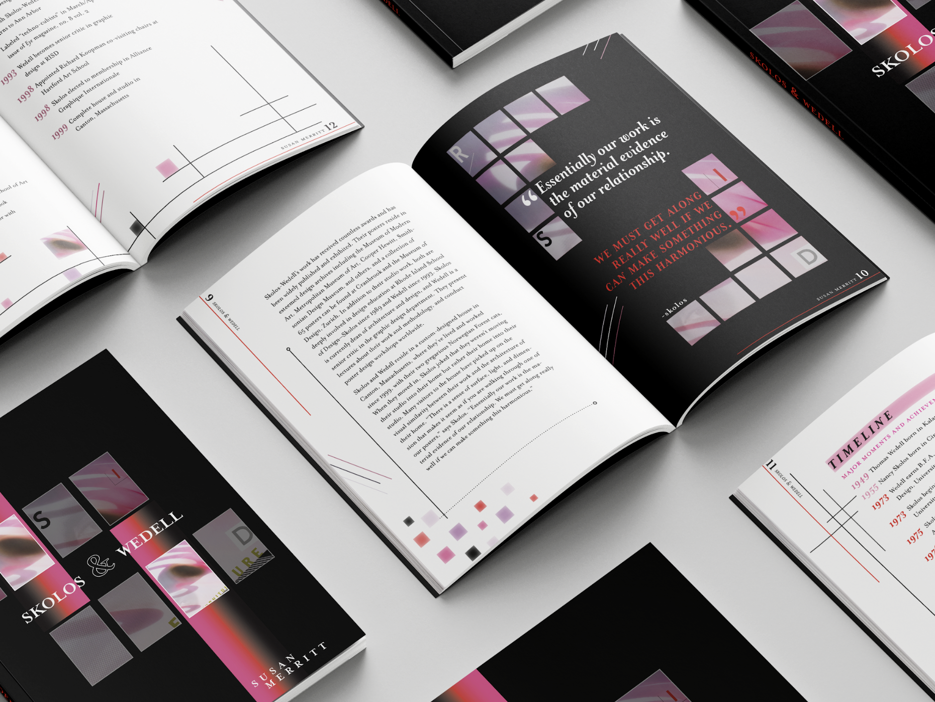
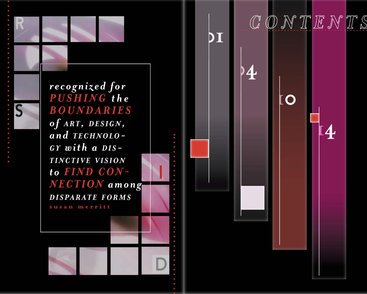
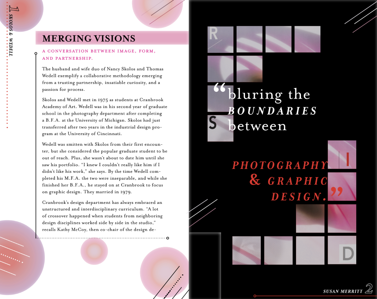
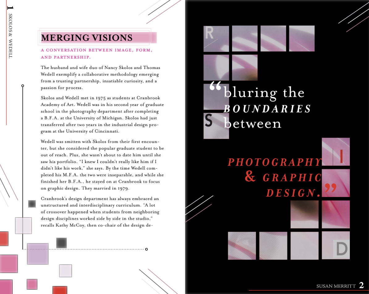
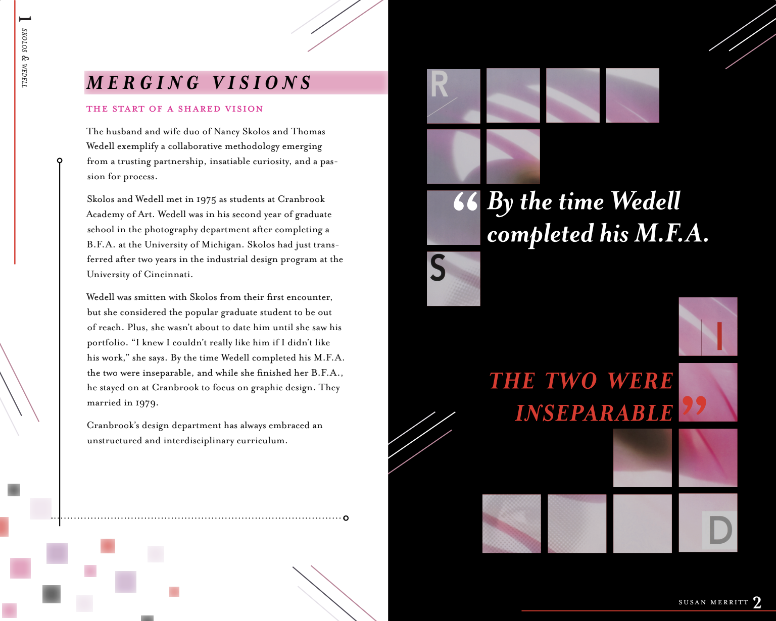
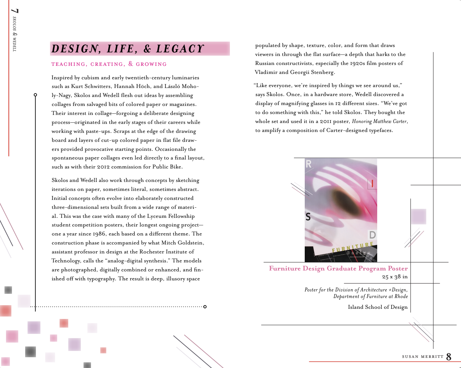
Content + Quote
-
![Content + Quote]()
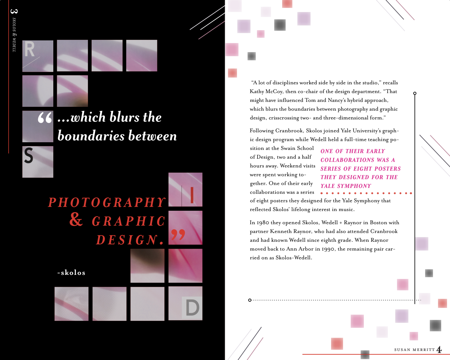
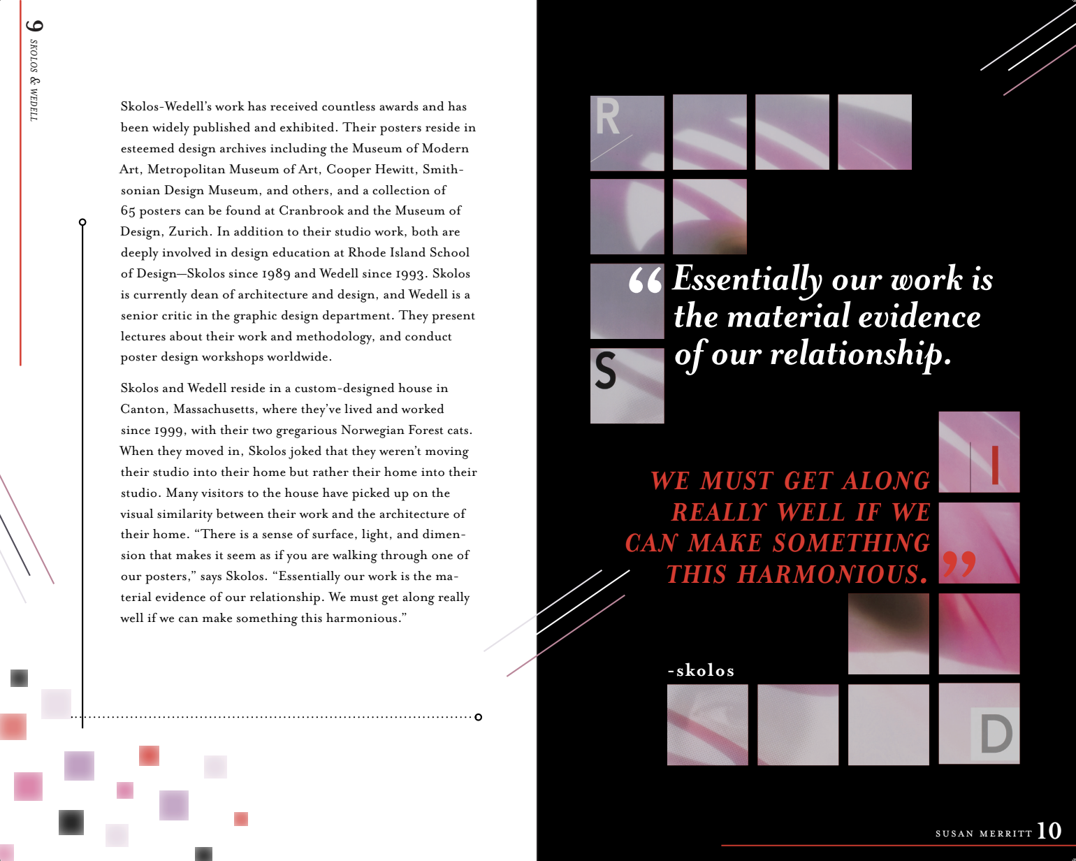
Content + Quote
-
![]()
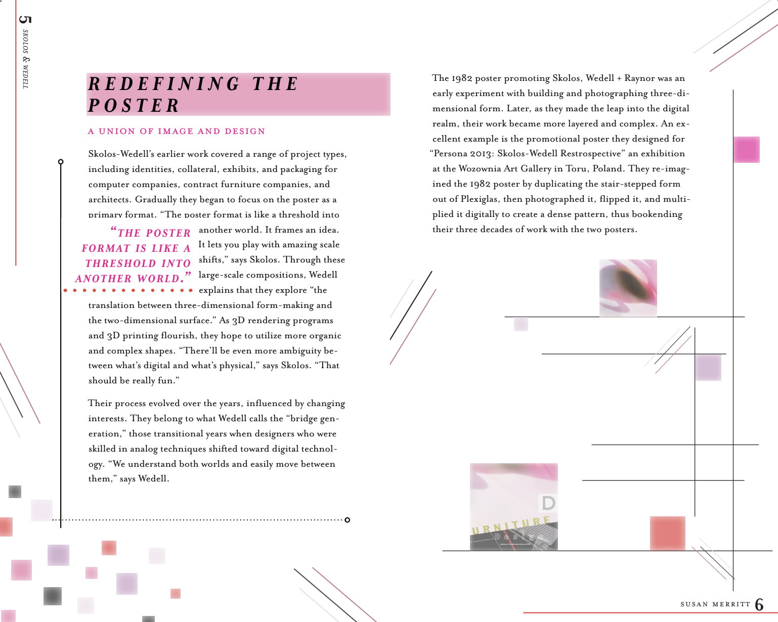
Content
-
![]()
New List Item
-
![]()
Content + Quote
-
![]()
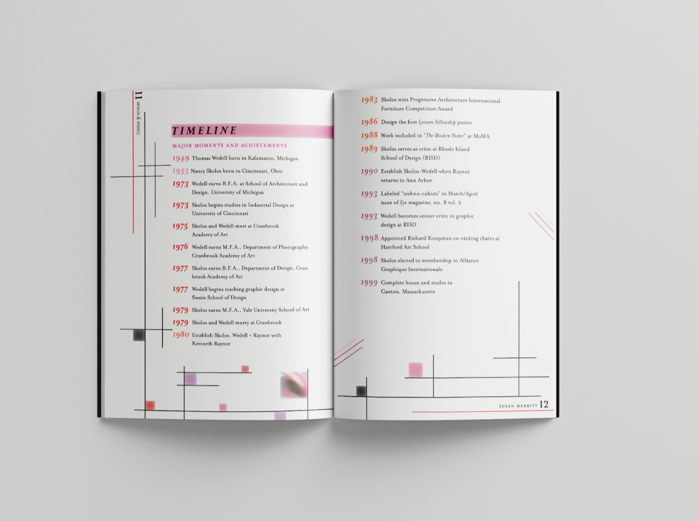
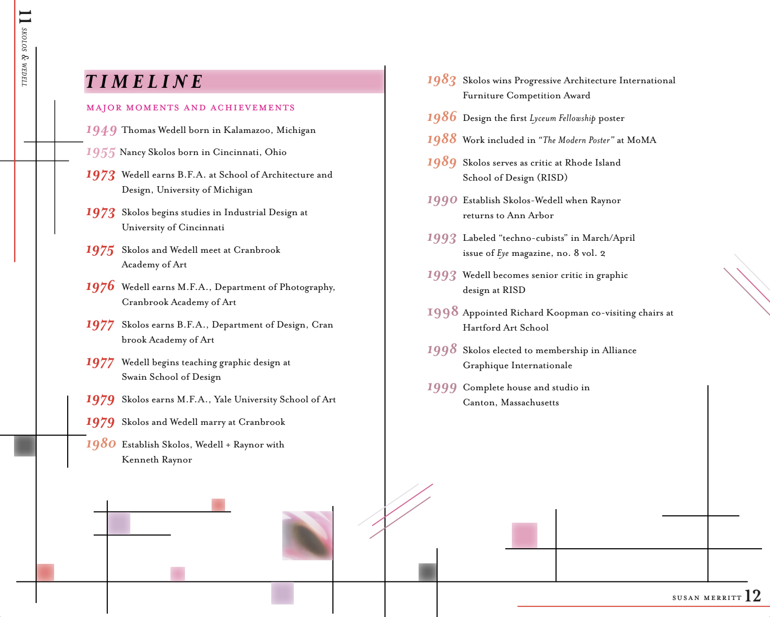
Timeline
-
![]()
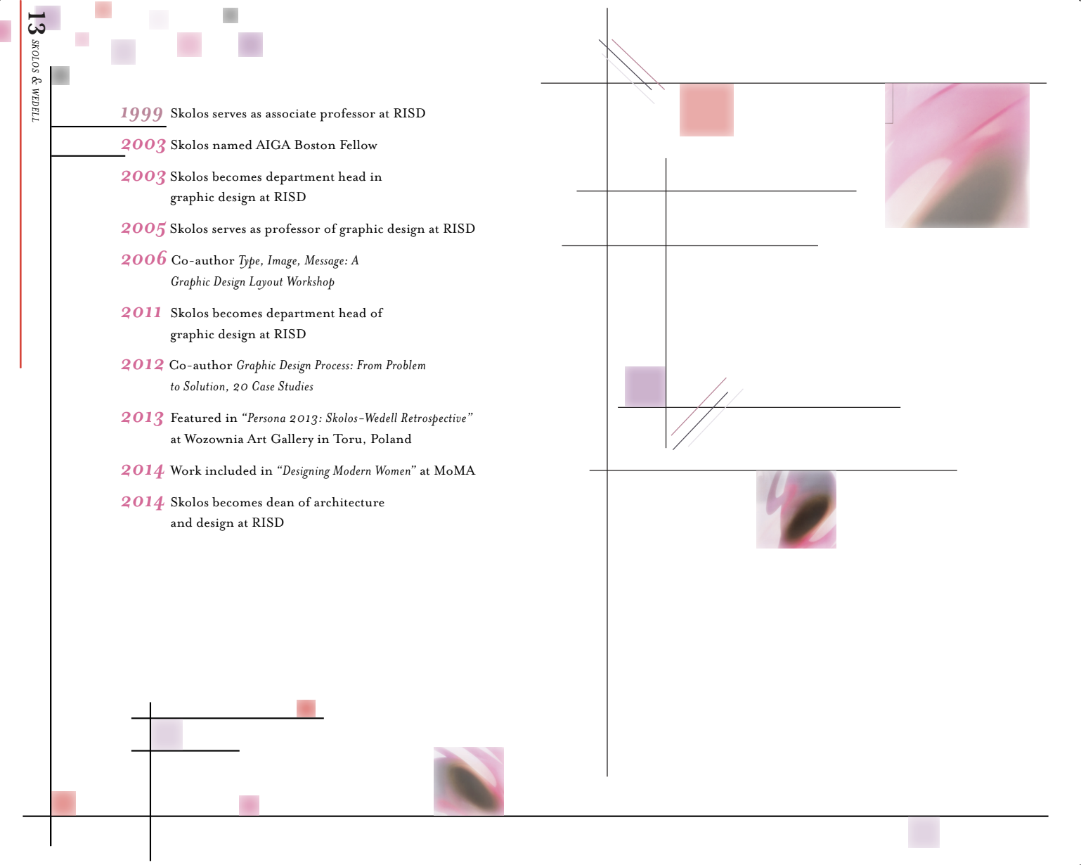
Timeline

Final Mockups
-
![]()
Cover
-
![Content + Quote]()
Table of Contents
-
![]()
Various pages
-
![]()
Timeline